devil’s donuts
Project role: Logo, Print advertisements, Brand identity
Project timeline: Three weeks
The challenge: Independently create a conceptual identity to compete with other brands in the food industry.
An approachable logo, modified typeface, and an identity that feels both classic and modern were created to bring a Little flavor to this donut shop.

The mascot
The devil’s donuts mascot (Sam) embodies everything the brand strives to communicate. cheekiness and approachability were the primary considerations when designing the friendly face of brand.
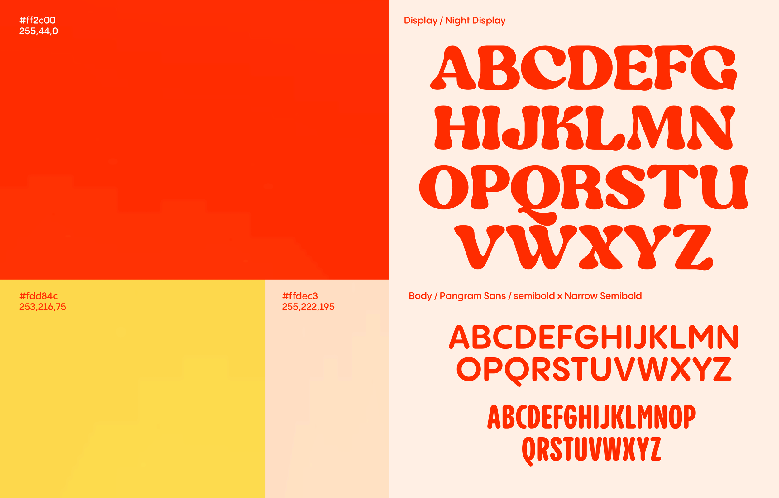
Visual language
“Night” the display font, evokes a warm and friendly feeling while also being legible from any size and distance. Additionally, it’s soft contouring edges mirror elements such as the horns and bowtie found elsewhere in the branding. This typeface also allowed me to create a hierarchy in the typography that tied all of the ad text into one clear identity.
The duo-toned color palette was chosen for its vibrancy and easy recognition. The burnt orange and yellow were meant to evoke flames without having to incorporate fire imagery in the brand.


The bowtie and horns are flexible and pervasive branding elements. They have a variety of applications including packaging or as accents for imagery in social media posts.


Software used
Adobe Illustrator
Procreate
Affinity Publisher
Affinity Photo
Image credits
https://www.pexels.com/@monstera/
https://www.pexels.com/@greta-hoffman/
https://www.pexels.com/@michael-burrows/
https://www.pexels.com/@anna-shvetz/